Presentation Page Basics for Your Virtual Summit


As simple as your virtual summit's presentation pages might seem, there's actually a strategy behind them. This strategy will increase your impact and sales, get your attendees better results, and properly showcase your speakers.
We'll cover the goal of your presentation pages, a big mistake to avoid, and what should go on each page.
Presentation page goals
Presentation pages are the pages on your virtual summit's website that hold the summit presentation videos. These are the free version of the videos, not the version that’s in your all-access pass.
These should not just be links to the video on YouTube or Vimeo. These are pages on your summit's website with the videos embedded.
There are a few goals to keep in mind for this page:
- They need to display the presentation videos...of course.
- They need to keep your attendees focused on that specific video.
- They should not be full of distractions.
- They should feature your speaker.
- You should upsell your all-access pass.
Does each presentation need its own page?
Can you all of your presentation videos on the same page? I mean, technically, you can do whatever you want.
But personally, I don't like to set things up that way. It is easier on your end, but it's not a great experience for the attendees or speakers.
And if you've listened to me for very long, you know that they're the ones that matter!
Let's break it down a little more.
Attendee Experience
When you have a whole bunch of presentations on one page, it is cluttered and distracting. Attendees aren't as likely to sit and focus on one video, they're way more likely to skip around and get distracted.
Because of that, they're not as likely to actually complete a video, which means they won't watch until the end, get their action steps, and get all the information they need to get that transformation you want them to see.
Speaker Experience
Instead of them having one page with their presentation that only features them, putting several presentations on one page waters down any results your speakers will see.
You're not featuring them as much as you could. Having happy summit speakers and making sure they get results is important!
Making separate presentation pages for each speaker really doesn't take that much time.
When you set up your website, make a template for your presentation pages with placeholder information. Then, for each speaker, you or an assistant simply duplicate that template and fill in the information. I'm really not convinced that it really takes more time than putting them all on the same page...
We'll save the rest of the information I have on this for the Q+A episode next week!
What should be on your summit presentation pages?
There are a few key items that should be on each of your virtual summit's presentation pages:
- Session title - The session title should be at the top of the page.
- Speaker name - Under the session title should be the name of the speaker. You can have just their first and last name, or you can have their name and their business name.
- Video - Next comes the embedded presentation video. (I like to upload my videos to Vimeo (affiliate) for easy customization and embedding.)
- Chatbox (optional) - Beside or below the video is a great spot for a chatbox. This is optional, but it's a nice way to add engagement to a pre-recorded summit. You can schedule a time for each speaker to be in their chatbox for an hour and direct people to ask questions in your Facebook group after that.
- Next step buttons - Under the video come the next step buttons. The most important is a link to your speaker's freebie and/or worksheet.
- Speaker information (optional) - I've never included this, but have seen several summit hosts include the speaker's headshot, bio, and a couple of links. Up to you if you'd like to include it!
- All-access pass call-to-action - And finally, there should be a call-to-action to purchase the all-access pass. Remind attendees that they have 24 hours to watch the video, but they can upgrade for ongoing access and to get all of your awesome bonuses. I like to use the speaker's affiliate link for this since it's on their presentation page.
Presentation Page Order: session name - speaker name – video - optional chat box – next step buttons – Call to Action
Action Steps
Presentation pages are simple, but they still deserve thought, strategy, and your attention.
In the next episode, we will be covering some Presentation Page FAQs - stay tuned!
Resources
- Episode 21: How to Get Happy And Engaged Summit Speakers
- Episode 53: How to Craft an Engaging Virtual Summit
- Summit Host Hangout Facebook group
Pin it for later!


Presentation page goals
Presentation pages are the pages on your virtual summit's website that hold the summit presentation videos. These are the free version of the videos, not the version that’s in your all-access pass.
These should not just be links to the video on YouTube or Vimeo. These are pages on your summit's website with the videos embedded.
There are a few goals to keep in mind for this page:
- They need to display the presentation videos...of course.
- They need to keep your attendees focused on that specific video.
- They should not be full of distractions.
- They should feature your speaker.
- You should upsell your all-access pass.
Does each presentation need its own page?
Can you all of your presentation videos on the same page? I mean, technically, you can do whatever you want.
But personally, I don't like to set things up that way. It is easier on your end, but it's not a great experience for the attendees or speakers.
And if you've listened to me for very long, you know that they're the ones that matter!
Let's break it down a little more.
Attendee Experience
When you have a whole bunch of presentations on one page, it is cluttered and distracting. Attendees aren't as likely to sit and focus on one video, they're way more likely to skip around and get distracted.
Because of that, they're not as likely to actually complete a video, which means they won't watch until the end, get their action steps, and get all the information they need to get that transformation you want them to see.
Speaker Experience
Instead of them having one page with their presentation that only features them, putting several presentations on one page waters down any results your speakers will see.
You're not featuring them as much as you could. Having happy summit speakers and making sure they get results is important!
Making separate presentation pages for each speaker really doesn't take that much time.
When you set up your website, make a template for your presentation pages with placeholder information. Then, for each speaker, you or an assistant simply duplicate that template and fill in the information. I'm really not convinced that it really takes more time than putting them all on the same page...
We'll save the rest of the information I have on this for the Q+A episode next week!
What should be on your summit presentation pages?
There are a few key items that should be on each of your virtual summit's presentation pages:
- Session title - The session title should be at the top of the page.
- Speaker name - Under the session title should be the name of the speaker. You can have just their first and last name, or you can have their name and their business name.
- Video - Next comes the embedded presentation video. (I like to upload my videos to Vimeo (affiliate) for easy customization and embedding.)
- Chatbox (optional) - Beside or below the video is a great spot for a chatbox. This is optional, but it's a nice way to add engagement to a pre-recorded summit. You can schedule a time for each speaker to be in their chatbox for an hour and direct people to ask questions in your Facebook group after that.
- Next step buttons - Under the video come the next step buttons. The most important is a link to your speaker's freebie and/or worksheet.
- Speaker information (optional) - I've never included this, but have seen several summit hosts include the speaker's headshot, bio, and a couple of links. Up to you if you'd like to include it!
- All-access pass call-to-action - And finally, there should be a call-to-action to purchase the all-access pass. Remind attendees that they have 24 hours to watch the video, but they can upgrade for ongoing access and to get all of your awesome bonuses. I like to use the speaker's affiliate link for this since it's on their presentation page.
Presentation Page Order: session name - speaker name – video - optional chat box – next step buttons – Call to Action
Action Steps
Presentation pages are simple, but they still deserve thought, strategy, and your attention.
In the next episode, we will be covering some Presentation Page FAQs - stay tuned!
Resources
- Episode 21: How to Get Happy And Engaged Summit Speakers
- Episode 53: How to Craft an Engaging Virtual Summit
- Summit Host Hangout Facebook group
https://summitinabox.co/apply
Pin it for later!


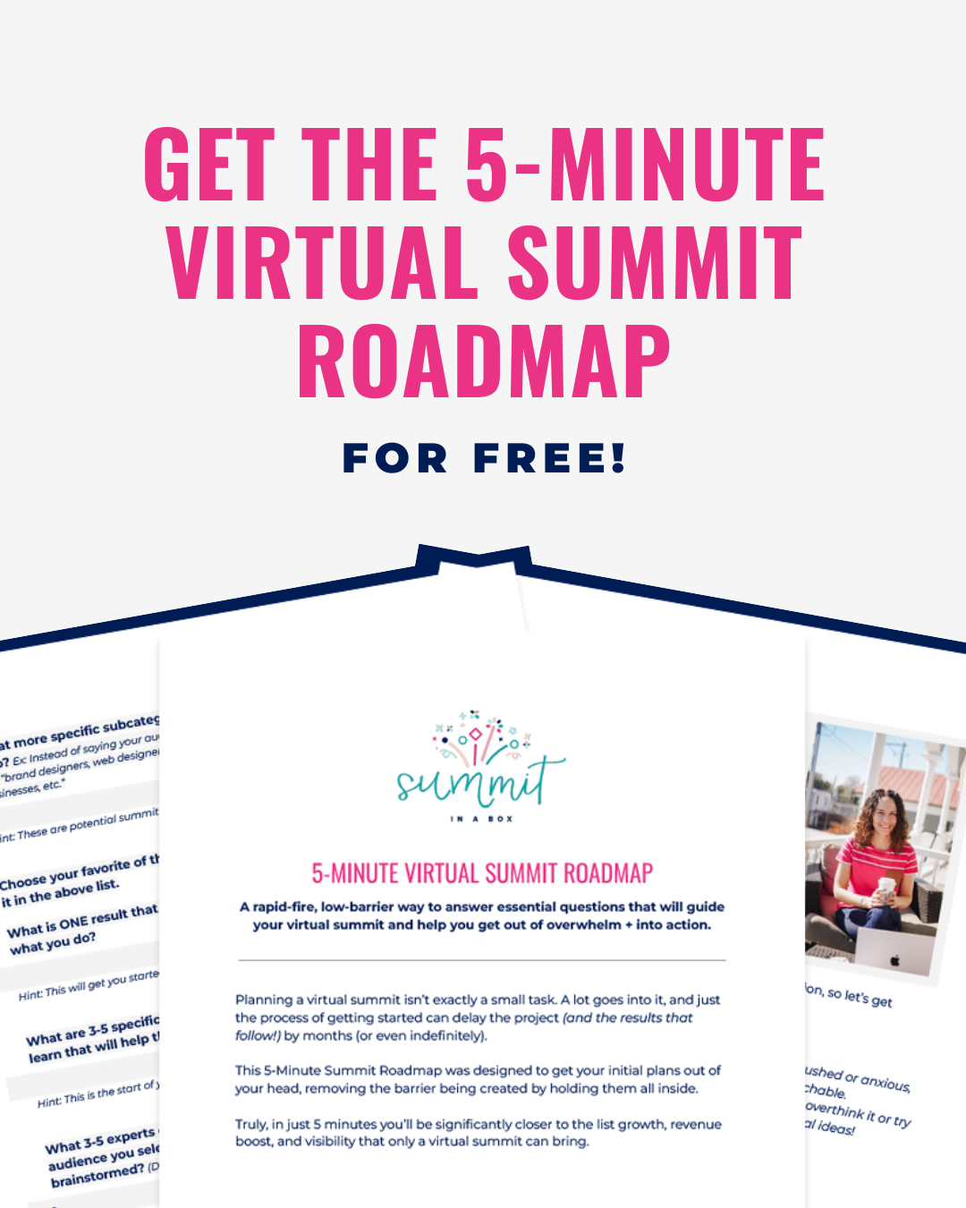
5-Minute Virtual Summit Roadmap
The 5-Minute Summit Roadmap leads you through the 7 essential questions that will guide the rest of your summit planning process and help you finally start making meaningful progress toward a profitable event.

